Tips for Creating Beautiful and Effective Emails
I, like most people, send and receive a lot of emails on a daily basis. Some of those emails capture my attention better than others. That got me thinking about what makes an effective (meaning it is read) email. For those that attended my session at BRAINSTORM 2017, you will recognize many of these suggestions!
There are several components to consider when creating an email.
Visual Appeal
Before we have a chance to read an email, we notice how it looks. First impressions are key so let’s consider a few tips to increase the chance of creating a good first impression.
- Color – Less is more so use color sparingly. That said, ensure the colors that you do use match your chosen brand colors to ensure better recognition.
- Type – Newsletters vs. Confirmation/Transactional Emails – While both of these should be in line with your brand, they should look different from each other so that your audience can recognize which type of email they are receiving from you.
- Borrow Good Ideas. If you have a favorite newsletter, take a moment and study it. Figure out what it is about that newsletter that you like and see what best practices you can adapt for your emails.
What will you say?
We are all busy, often multi-tasking and our attention span is very short. Remember that as your guiding principle to decide what information needs to be included.
- Follow the KISS principle – “keep it short and simple”.
- Make sure the key messages are presented first, as suggested in the BLUF principle.
- For instance, you can open with a TL;DR – Your message expressed in 5-7 words per bullet in a list. Hit your audience with pure information in those first critical few seconds, and them allow them read it in detail in the rest of the email.
- Be clear about the next steps – Is the ball in their court or yours? What are the action items and by when?
- Don’t spell out URLs and use social media icons instead of words.

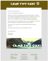
A Picture says a thousand words
Images are often a nice touch in emails and they help with identification and message communication. A few key things to note about images:
- Remember that sometimes senders turn off images so ensure that your image isn’t the only way an important piece of information is being communicated.
- Dimensions – make sure you know the proper dimensions for your email client. Within CampBrain, having images at least 711 pixels wide will ensure they will cover the entire width. Don’t worry if the image is larger than 711, we’ll scale it down for you.
- Size – seeing an image that is pixelated detracts from the user’s experience. Ensure that the image is of the proper size and resolution.
The Footer
All emails should have a few standard elements in the footer to make things easier for your reader.
- Unsubscribe Option – If your reader decides not to receive your emails any longer, make it easy for them to unsubscribe. That is not only thoughtful but also a good way to comply with anti-spam regulations. A simple mailto: link to your office with the word “Unsubscribe” in the subject will do the trick. Check out this website that will generate the code for you.
- Method of Contact – let people know how they can get in touch with you.
- Legal and Disclaimers – keep in small font. Even better, have a full disclaimer on your website, and simply link to it from the footer.
Hope that helps you as you send out the emails to all your various audiences. If you have any questions about sending emails through CampBrain, don’t hesitate to give us a call.
Happy Emailing!

Love your Software, LukeW lukew@campbrain.com